How something looks is part of good design
A lot of people have heard something along the lines of, “design isn’t how it looks. It’s how it works.”
This is not the full or accurate quote from Steve Jobs:
“The design is not just what it looks like and feels like. The design is how it works”
A lot of people miss that “not just.” It’s a key part of this quote of his. Good design must work well, but there is no reason we shouldn’t care how it looks and feels. No one would ever accuse Steve Jobs of making products that don’t look good.
The core part of good product design IS how it works. I will never not die on that hill. But a well designed product should look and feel nice.
I define the five areas of UX the same as Rex Hartson and Pardha Pyla:
Usability
Utility
Functional Integrity
Visual Design
Persuasiveness
These five areas work in concert to make a great user experience. Yes, a product that has a strong visual design but has no utility or usability won’t have much value, but people relate stronger to products that have a strong, thoughtful visual design.
A strong visual design can encourage more people to use a product and to encourage them to use it in more contexts.
Compare these two home theater concepts:
This is the classic messy traditional home theater. Big, unattractive speakers that stand out. Lots of wires. Lots of components.
When you have a setup like this, you pretty much need to put it in a dedicated home theater space. Most people do not want their main living room to look like this.
This is a Sonos Arc and Sub. It’s wireless, and the visual design is meant to both look good in your home and not stand out (Sonos products come in both white and black for your decor preferences).
So why does this matter? Because a lot of people will never buy a receiver and standalone speakers. It’s never going to happen. And if people aren’t willing to buy traditional home theater setups, and no one makes more usable, more attractive options, people will be left with a subpar listening experience for movies and TV shows at home.
That first setup is ugly, takes up a lot of space, and dominates a room. But millions of people have decided to go with soundbars, and Sonos and some other companies have created premium soundbars that sound really good while looking good.
The future of home theater audio is in making soundbars sound and look better and better. That’s where all of the innovation and optimization is going to happen. And, frankly, that’s where all of the revenue growth is going to happen.
For people who have the space for a dedicated home theater that they don’t use for anything else and want to spend the time, effort, and money to properly run wire through walls and ceilings, a dedicated home theater can be really great. But for the vast majority of people who don’t have a dedicated space, soundbars are bringing better audio into the home while fitting in and not dominating a room.
And I’d dare say that some of these soundbars are downright attractive.
Visual design can also help make a product feel more approachable. Look at how far we have come with personal computer operating systems.
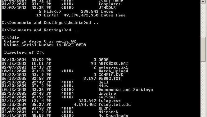
This used to be what using a personal computer looked like when you weren’t in a dedicated application. The advent of graphical user interfaces (GUI) radically changed how approachable computers were. Without GUIs, a large portion of people wouldn’t use computing devices, and we certainly would have modern smartphones.
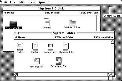
This is what the original 1984 Macintosh operating system looked like. It’s not that dissimilar from modern MacOS or Windows! Apple utilized a GUI and a clever desktop metaphor to make computing more approachable.
The world would be radically different with GUIs. Early GUIs had some strong drawbacks, but what they did was make computers more approachable and friendlier. A lot of power users resisted getting a computer with Windows or MacOS until those operating systems got really mature, but at the same time Windows and MacOS brought an entire new generation of users to computers.
Good visual design should help you accomplish a goal, such as getting more people use a product or feature.
There is no right or wrong visual design language. What is wrong is not caring about. Good design cares about all of the core components of good design.


